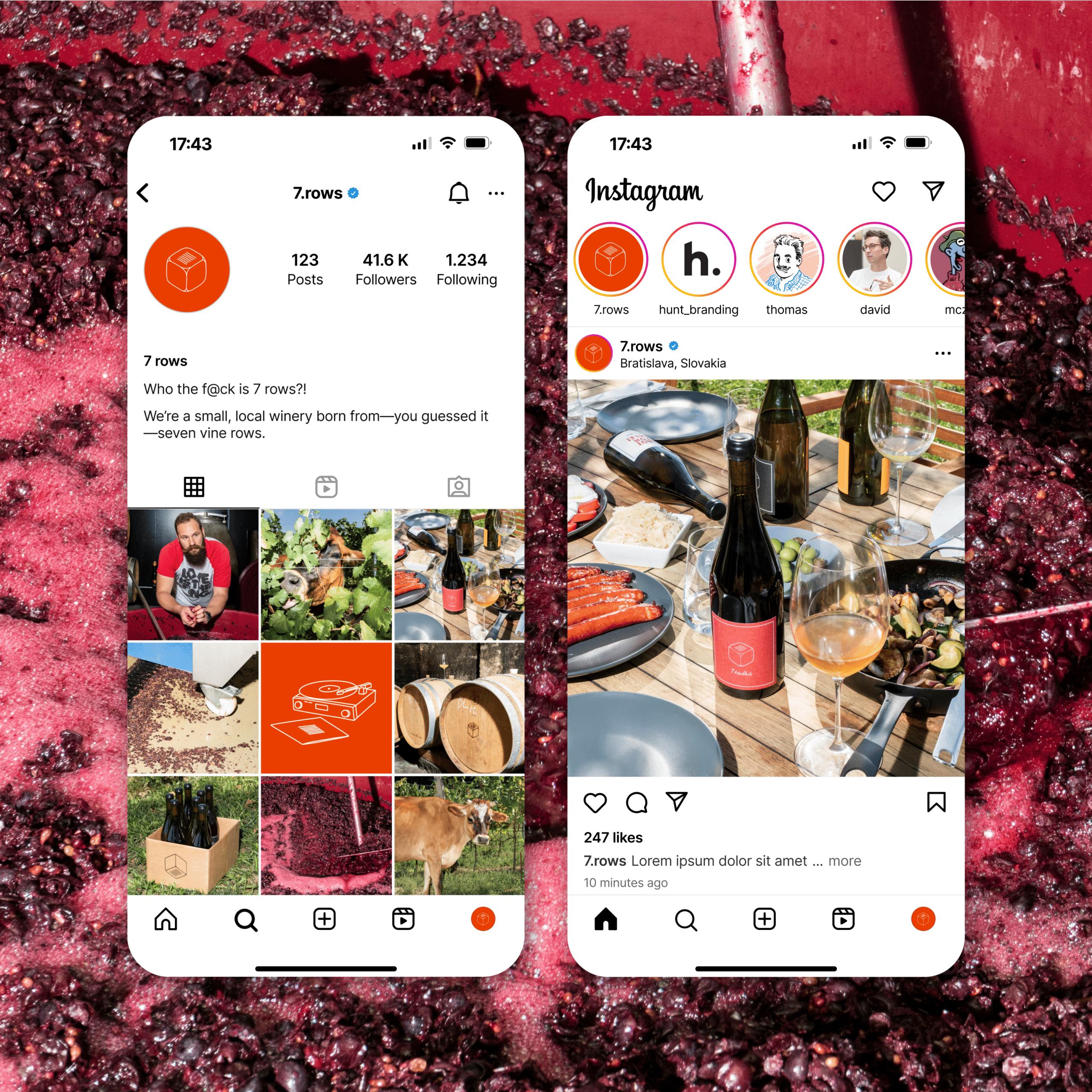

When we stepped in, the brand already had a name and a logo. Our job was to build a bold identity and create an engaging website.
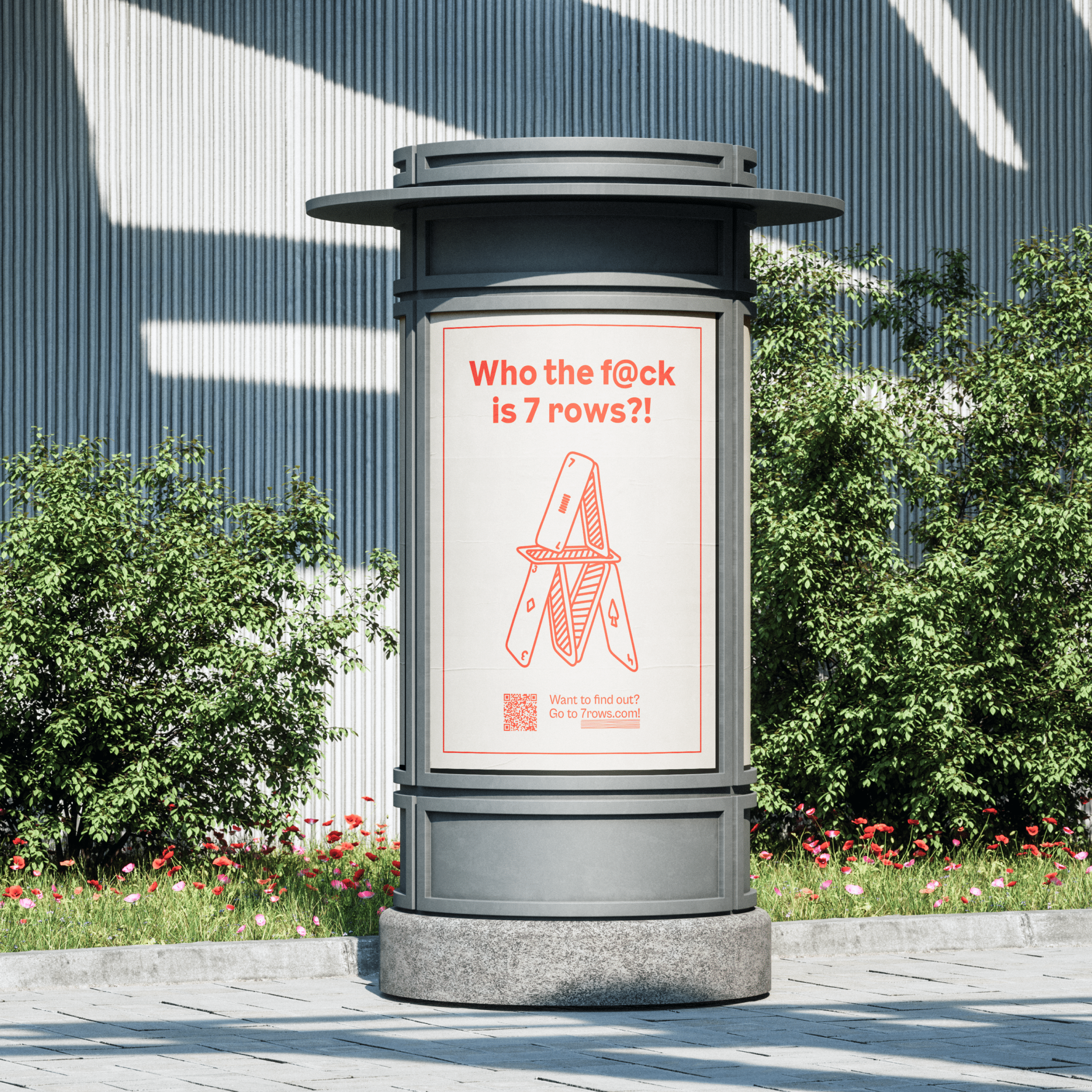
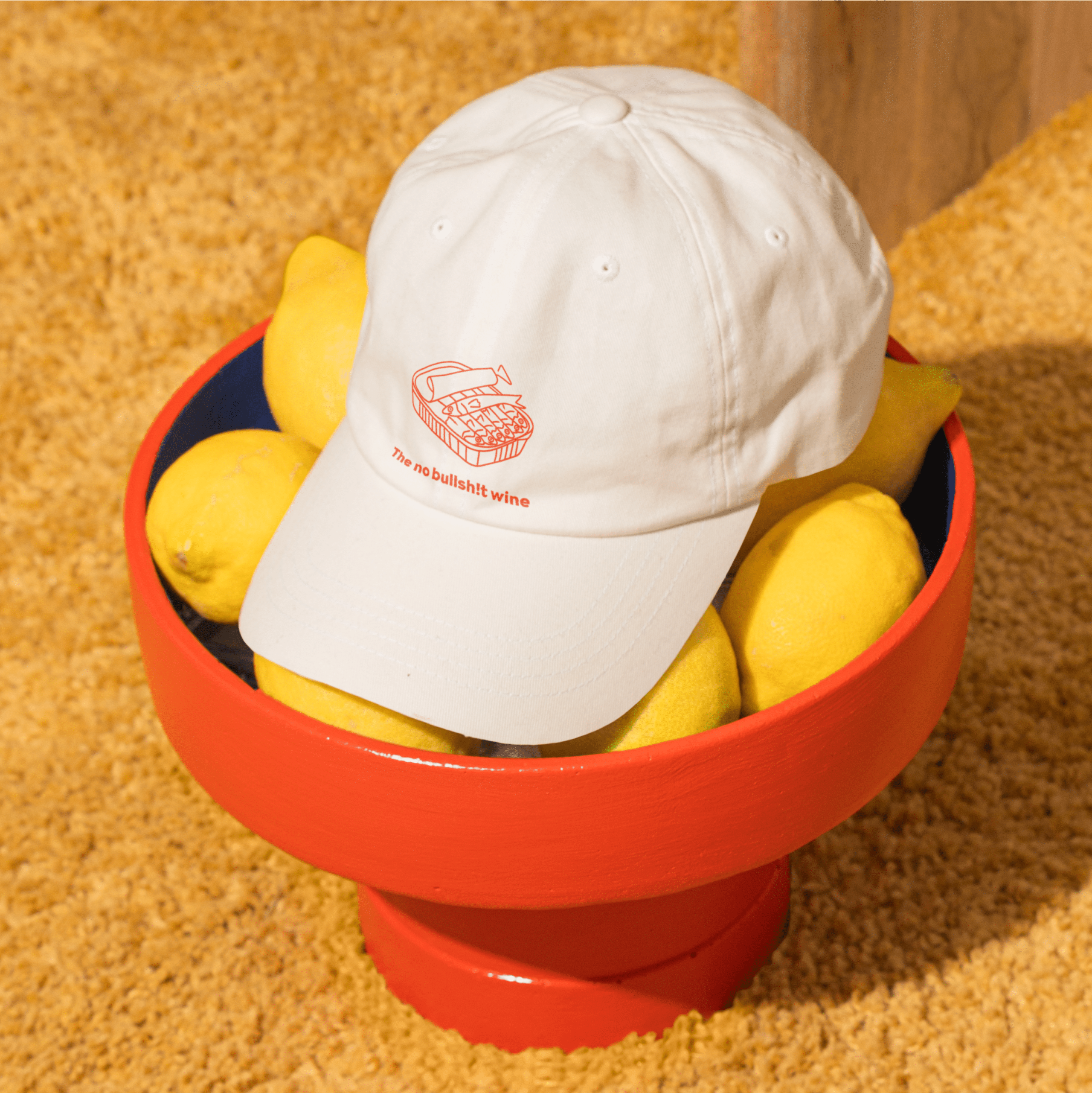
Starting with the verbal identity, we dug deep to bring out the brand’s rebellious, no-bullshit vibe. The result? A voice with attitude—raw, punk, and brutally honest. And with the tagline, “The no bullsh!t wine,” we made sure this brand says exactly what it means.
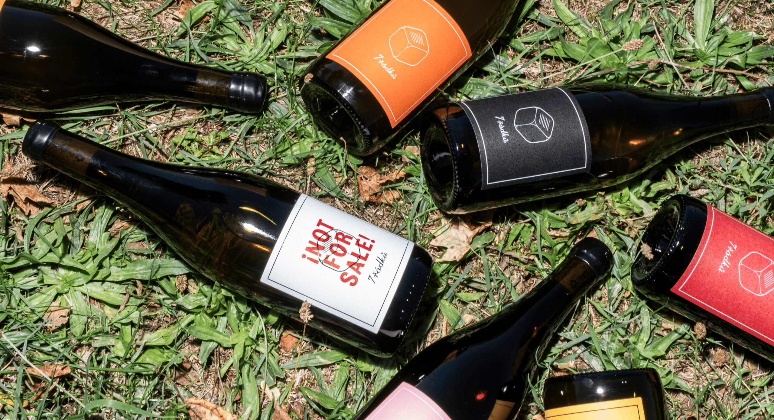
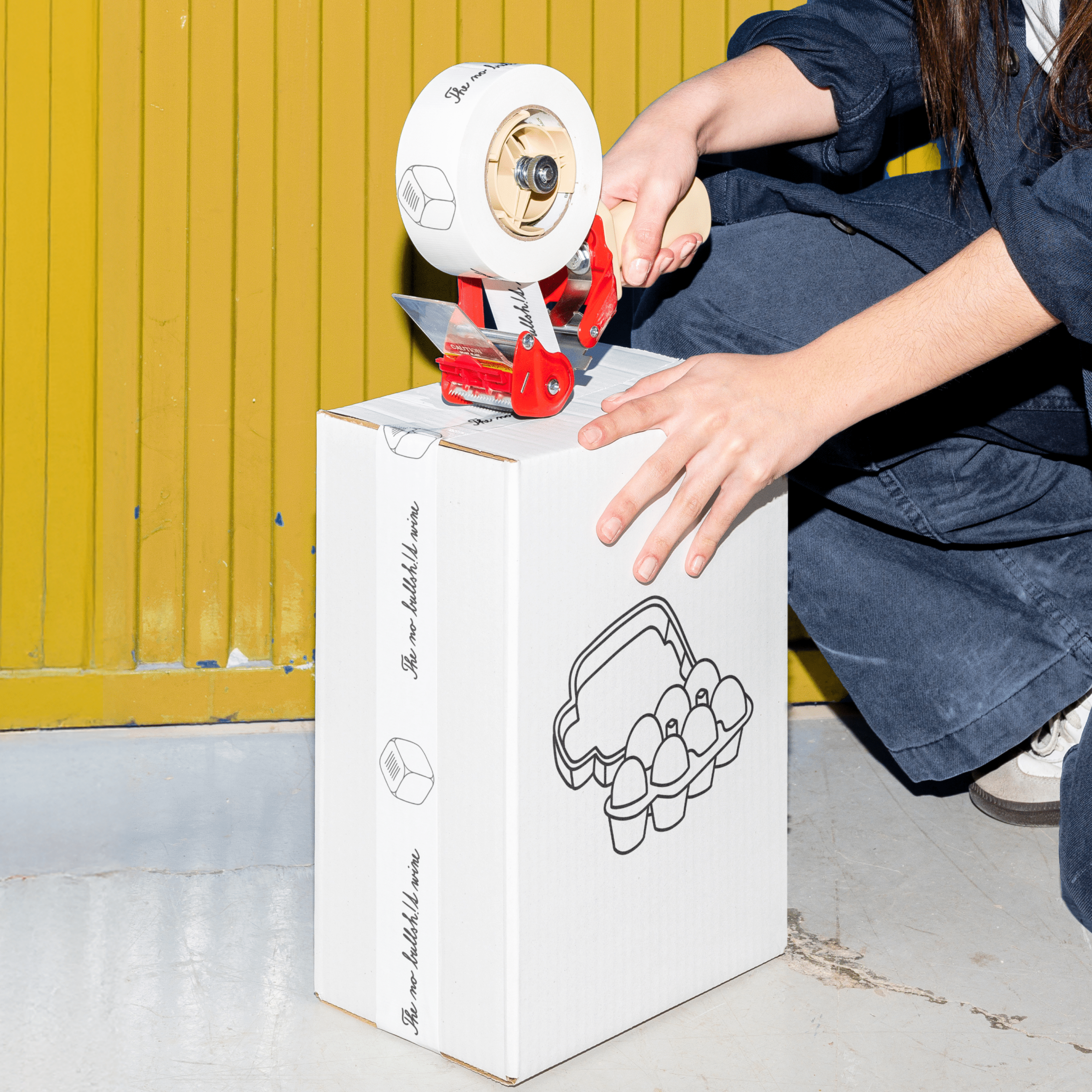
For the visuals, we didn’t hold back either. We went bold with a vibrant orange and added quirky illustrations to the dice logo, with a touch of magic and absurdity to capture that playful edge.
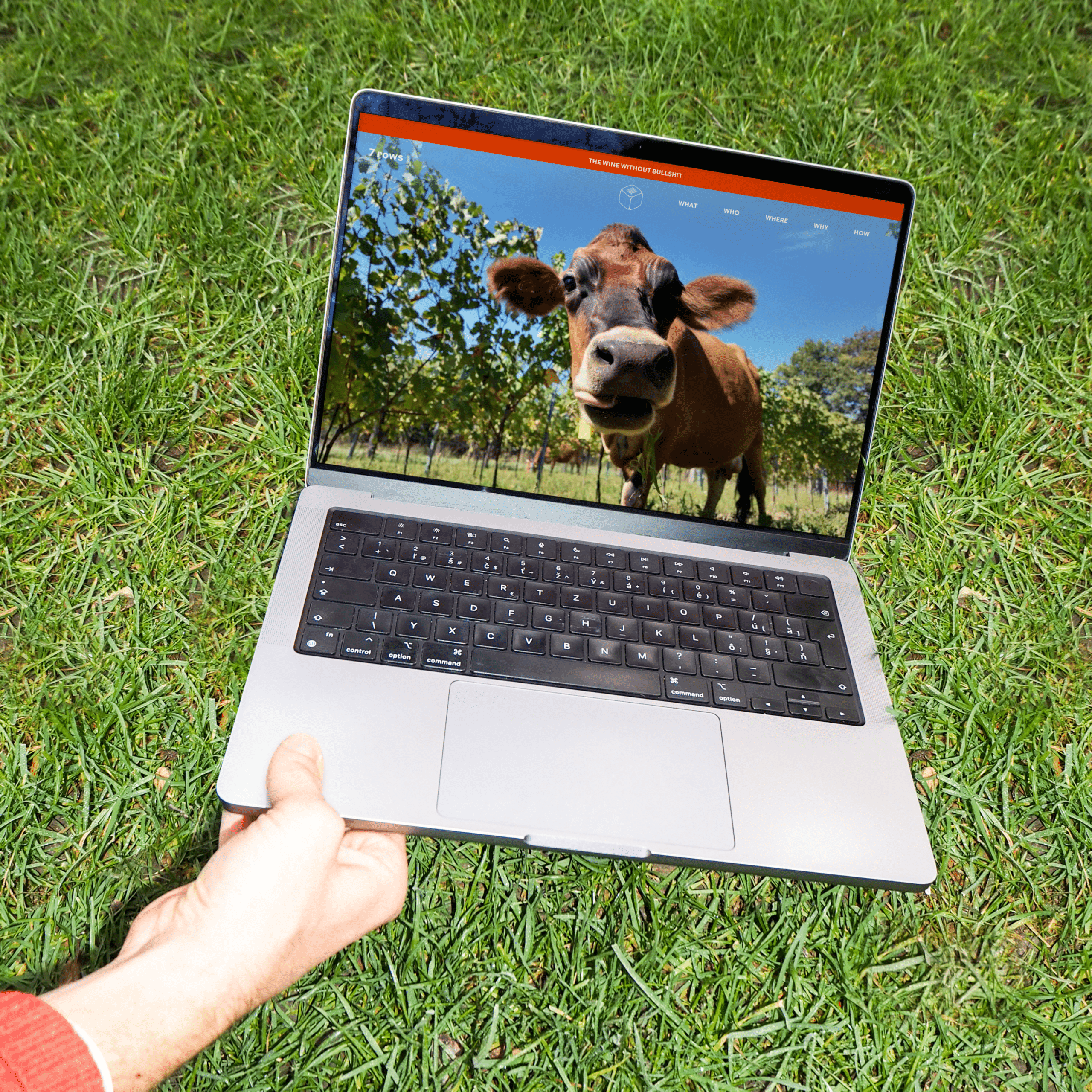
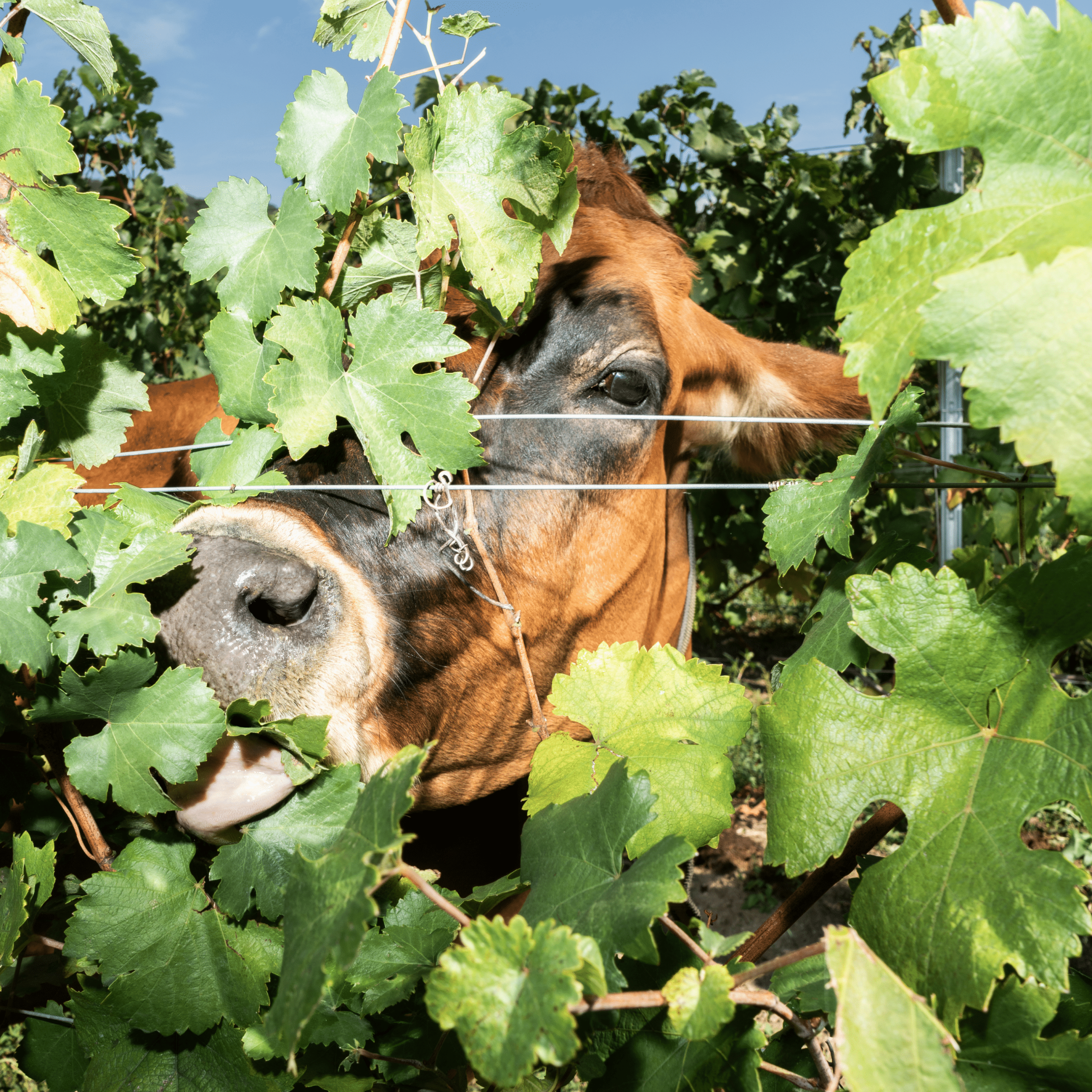
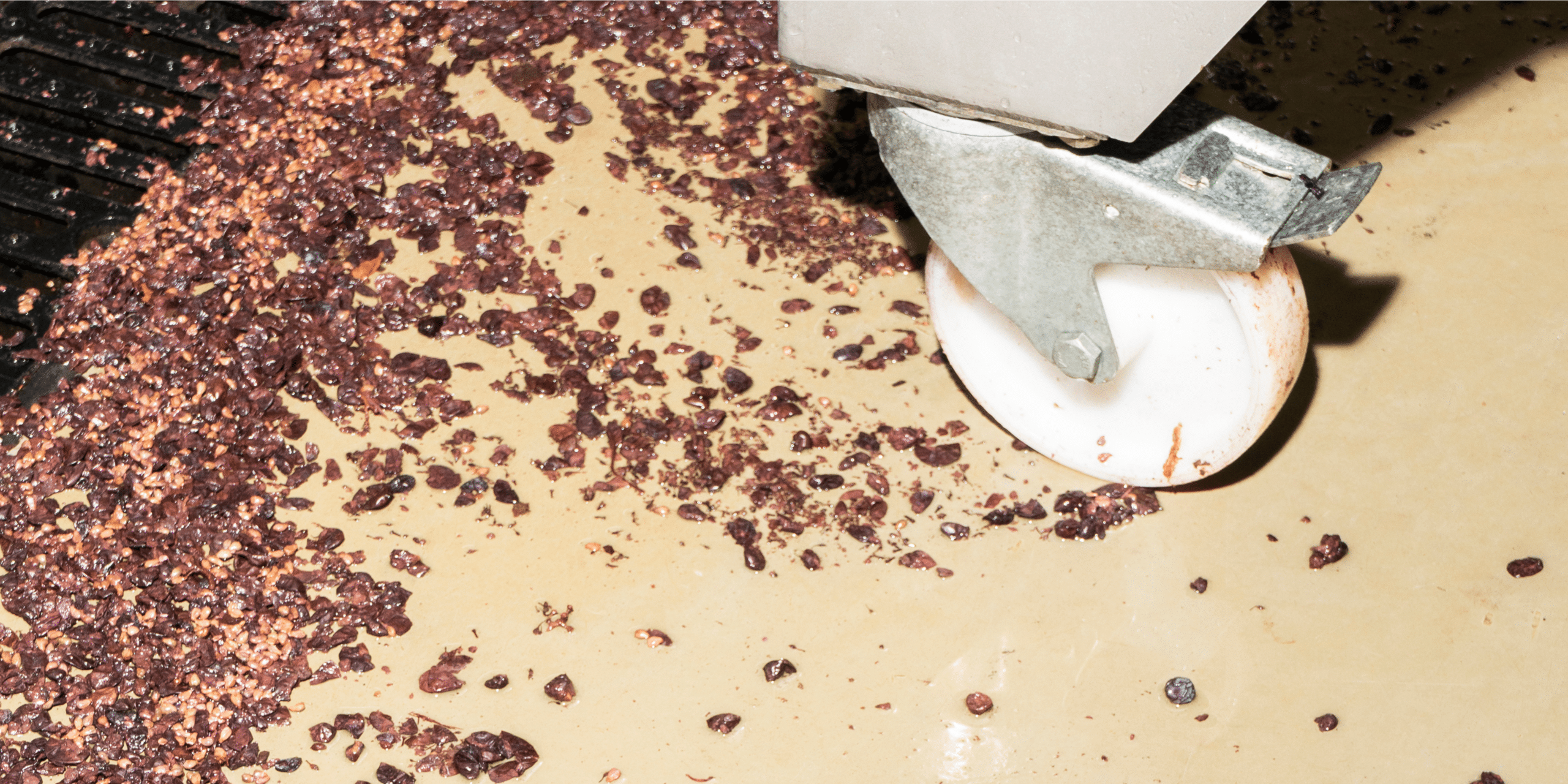
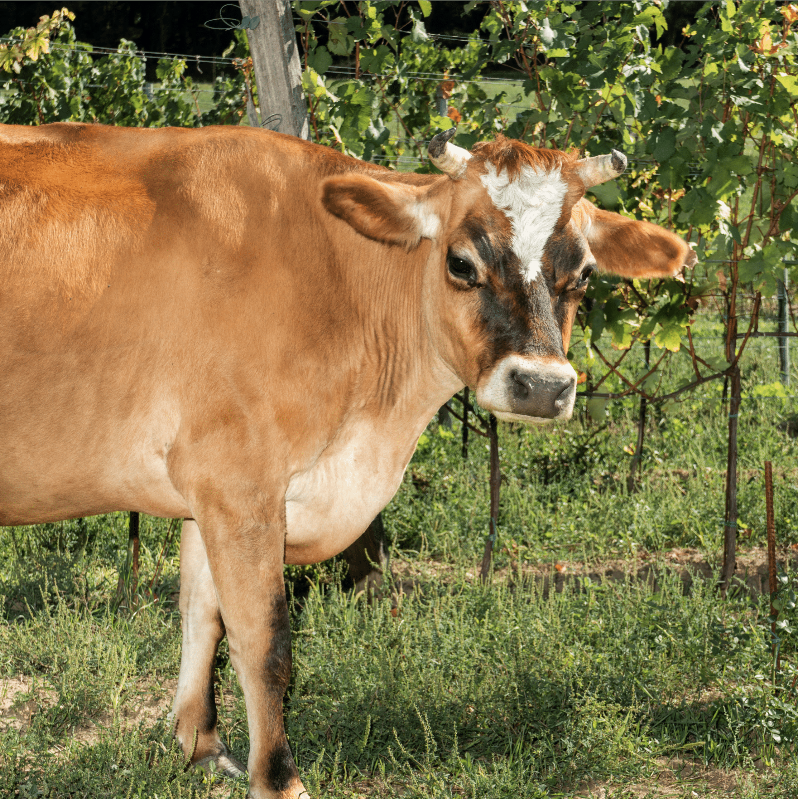
To tie it all together, we did a raw, eye-catching photoshoot to show what the winery is about. And the website? Though it’s just a single page, it’s packed with hidden gems. Play some music, or roll the dice to reveal contact info—you never know what you’ll discover next.

