When the team behind ready-made oat porridges came to us, they knew it was time for a change. Bugu just didn’t cut it anymore. The goal? A name and identity that felt as fresh and energising as the product itself.
Credits
Brand strategy
Jakub Hrušovský
Creative direction
Aneta Marcely
Visual identity
Paulína Kvaššayová
Case study design
Paulína Kvaššayová
Naming & verbal identity
Adriana Takáčová
Photoproduction
Jakub Michal Teringa
Videoproduction
Renáta Koutenská
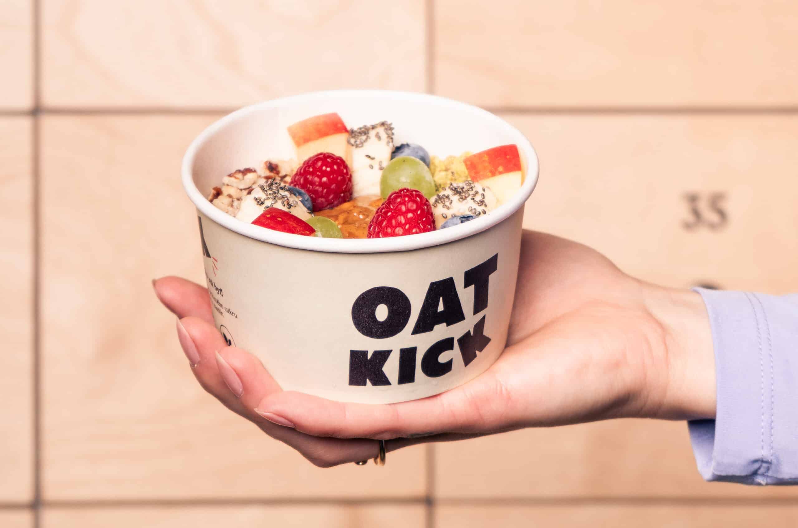
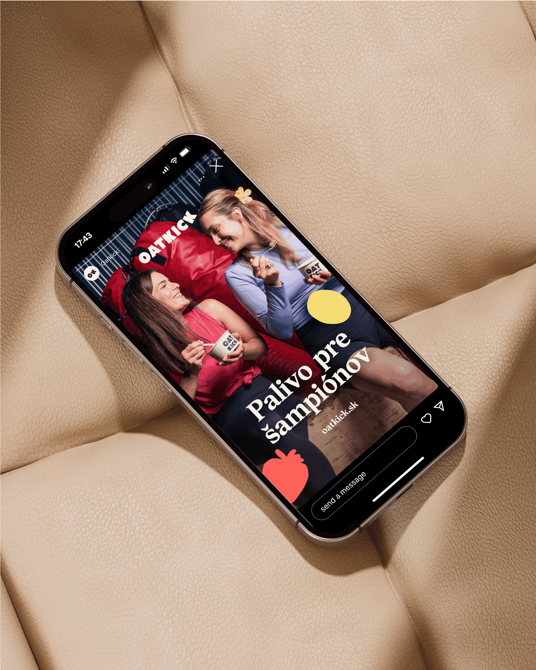
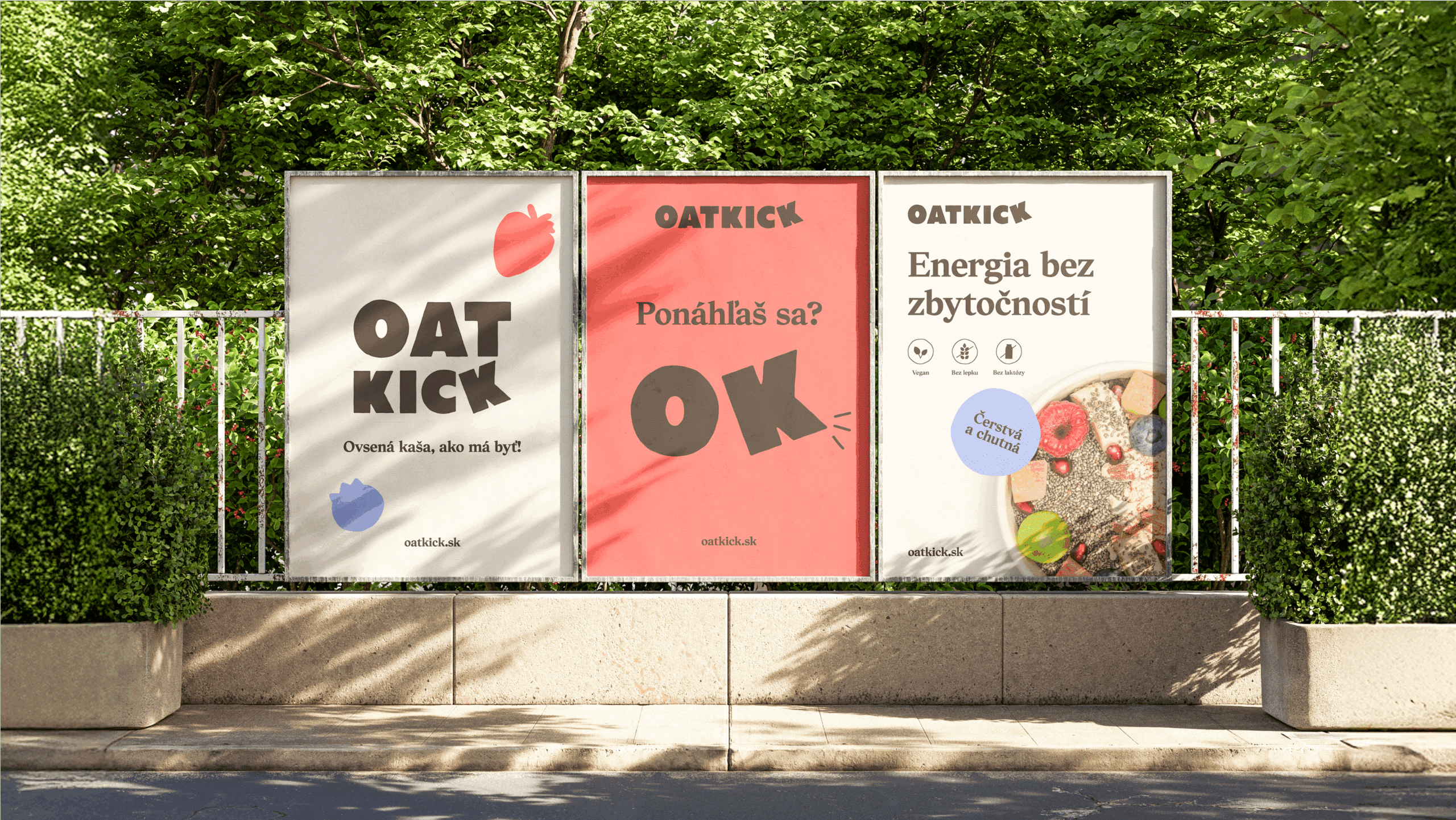
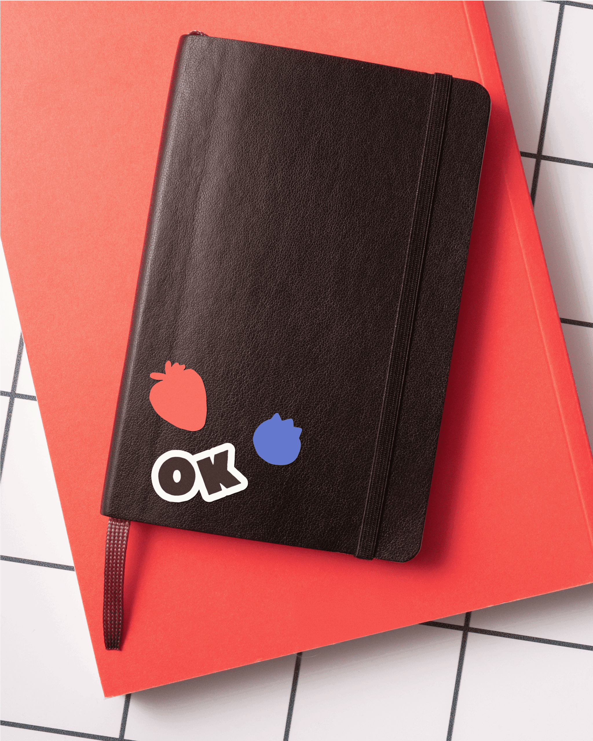
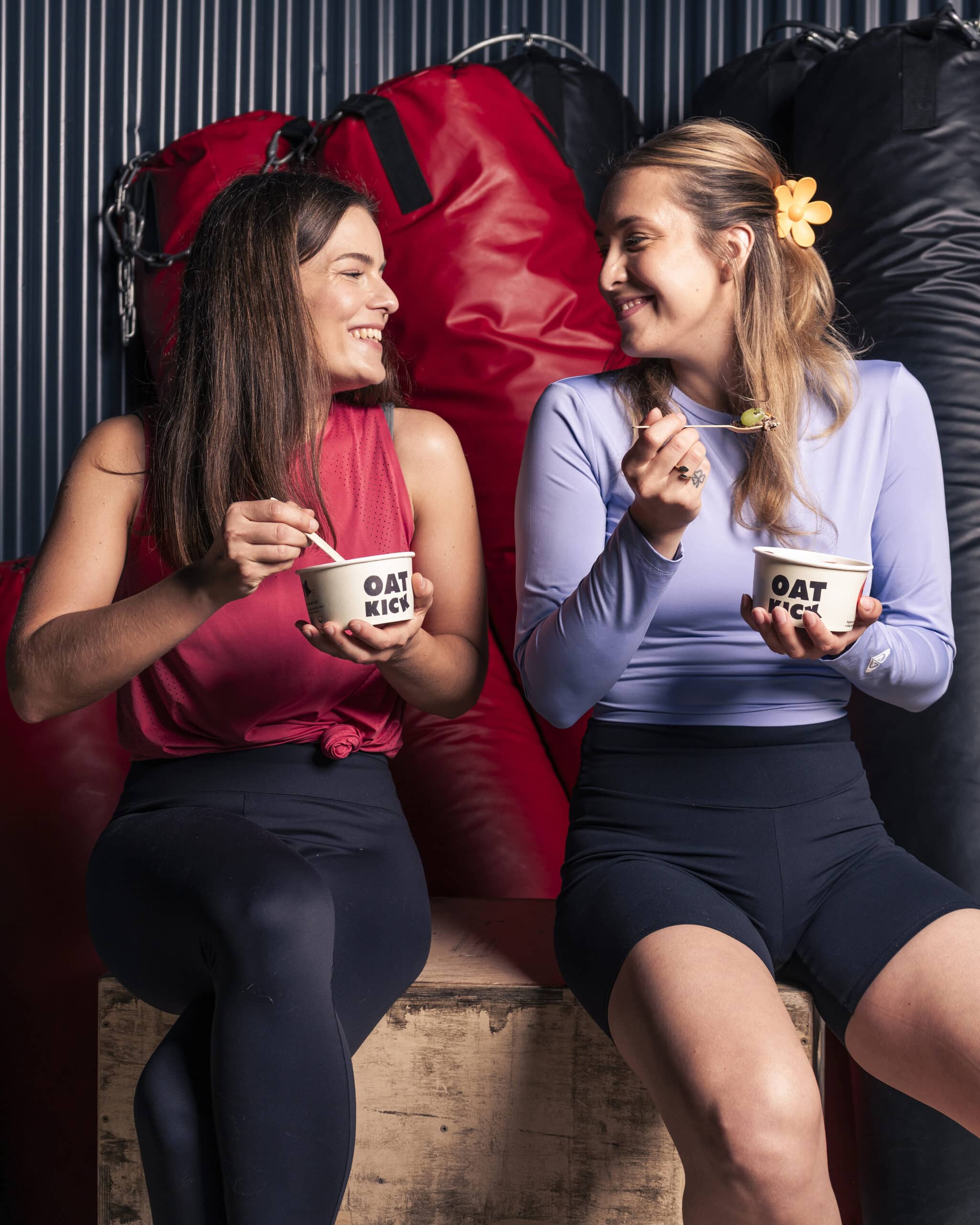
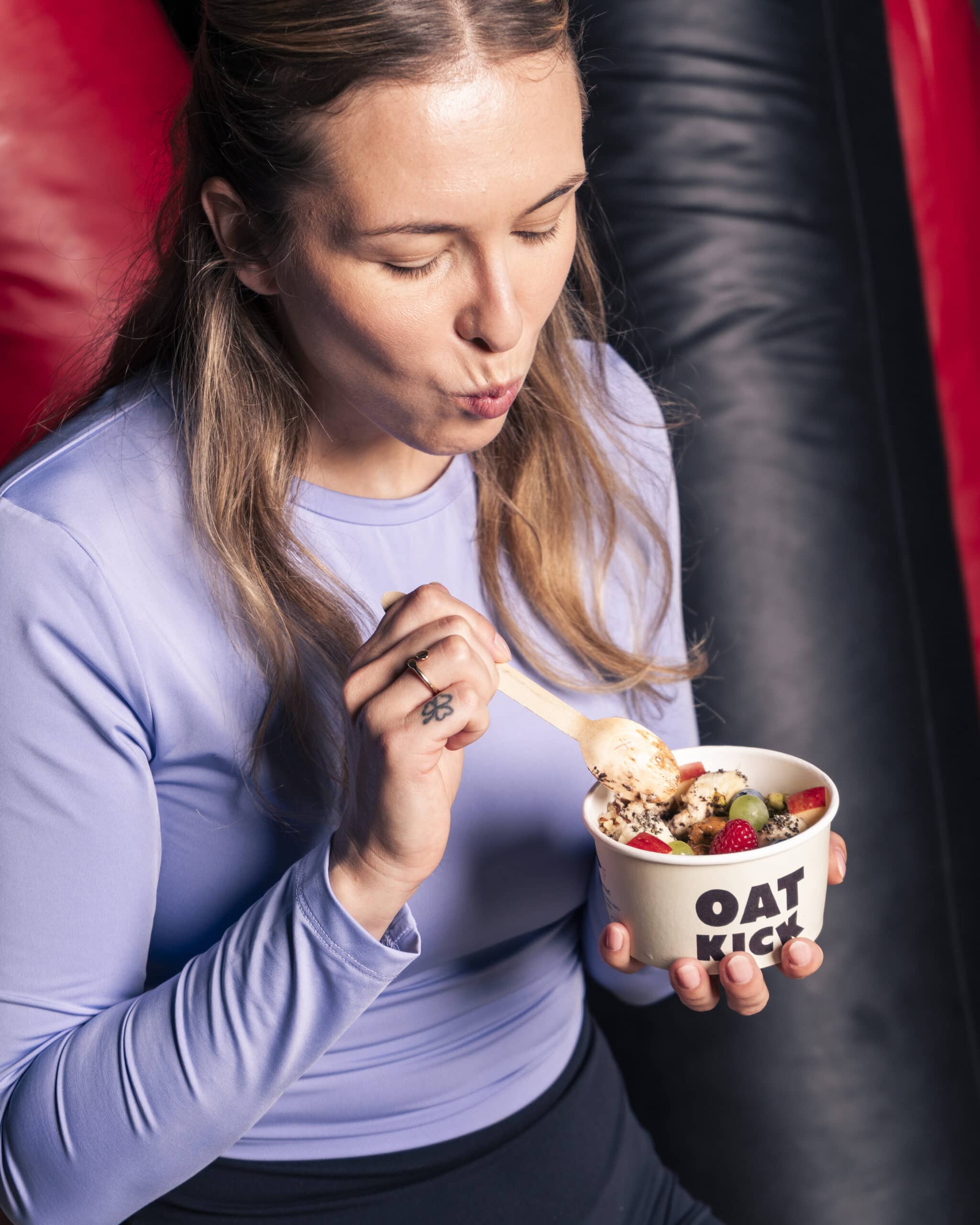
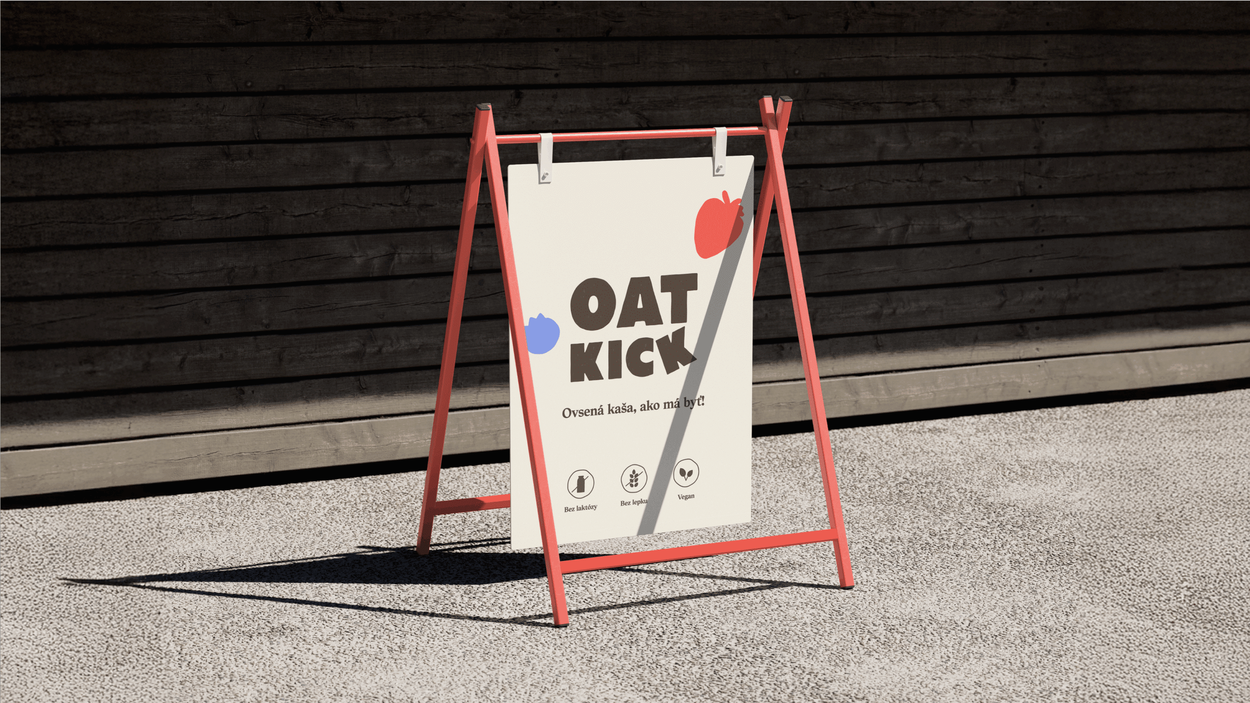
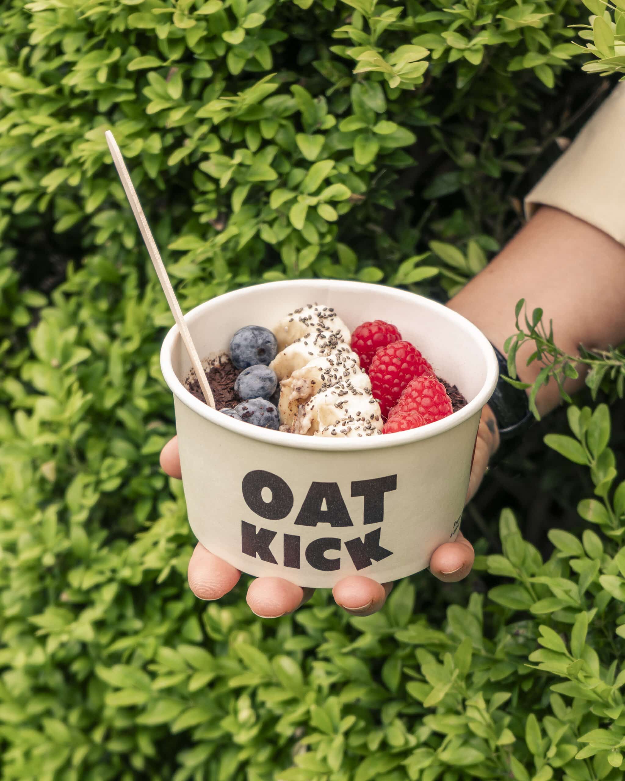
We landed on Oatkick – a name that says exactly what it does. Oats. Energy. Boom. It’s made to fuel your day without slowing you down. We also created a fun shortcut: OK. It works as a verbal wink, a visual stamp, and a way to say “yep, you’re good to go.”
Visually, we mixed warmth and energy. Earthy neutrals keep it grounded in real food, while pops of red, blue and yellow bring in the fun. The tilted K in the logo? A little visual kick of motion.
We also played with bold shapes and fruit stickers that work like mini billboards. They carry messages, add flavour, and make the brand feel active and alive – just like its audience. It’s a brand that runs on good vibes, great food, and zero compromise.